This tutorial is the second part of the series "How To: Smart Home setup to track indoor temperatures and humidity with sensors, Raspberry Pi, MQTT, Node.js, Vue.js and Chart.js" (1 | 2 | 3)
In this part we will build a basic dashboard displaying smart home sensor data with charts. We could go with whatever implementation you would like here: from vanilla HTML/CSS/JS to every framework which is suitable to our needs - which are basically doing an API call to our backend to fetch sensor data and lift them up to work nicely with a chart visualisation. There are also other good solutions to deal with IoT frontends like Pimatic, OpenHAB and FHEM, but let's just build this part completely on our own. We will go with the SPA framework Vue.js with Quasar on top: It comes with UI components in the popular Material Design, axios and some other features, that help getting started with Vue.js very fast.
Install dependencies
Install the Vue.js (Link) and Quasar CLI (Github link) first!
npm install -g quasar-cli
Go to your project root and init a new sub project for your frontend code with
quasar init vue-frontend
Now start you development server on http://localhost:8080/ with
quasar dev
and you are ready to develop your frontend according to your likes. Quasar comes with a basic starter layout including a side navigation. However we don't need to work on this heavily and focus on the homepage, where we will build the dashboard functionality.
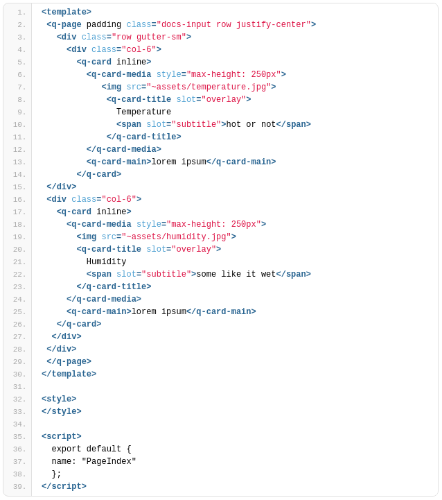
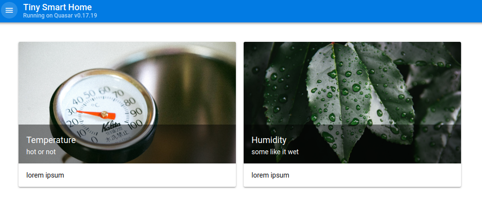
Go to Index.vue and update the basic dashboard layout. You can use static images like in my proposal and put them into the src/assets folder.


Fetch sensor data from Node.js backend
To fetch necessary data on initial page load we make use of Vue.js' created() function in the scripts section below the template. We insert a new function this.fetchData(); there and implement this new function in the methods' block.
methods: {
  fetchData() {
   this.loaded = false;
   this.$axios
    .get("http://localhost:3000/api")
    .then(response => {
       return response.data;
    })
    .then(response => {
      console.log(response);
      this.loaded = true;
    })
    .catch(e => {
      console.log(e);
      this.$q.notify({
       color: "negative",
       position: "top",
       message: "Could not fetch.",
       icon: "report_problem"
    });
  });
 }
}
We simply use the axios library (Github link) which Quasar included right from the setup, so we can use it globally without importing it explicitly. If this works properly you should be able to log the array of sensor data in your browser's developer tools. If there is any problem, we trigger the Quasar component notification and include the error message.
Hint: If you encounter CORS problems in the communication between front- and backend (e. g. "No Access-Control-Allow-Origin header is present on the requested resource.") edit your server.js and restart it as follows:
app.use(function (req, res, next) {
 res.header("Access-Control-Allow-Origin", "*");
 res.header("Access-Control-Allow-Headers",
    "Origin, X-Requested-With, Content-Type, Accept");
 next();
});
Build a line chart with Chart.js
In this part I will focus on displaying only the temperature chart to make the tutorial more comprehensable. At first we will install the npm package vue-chartjs (Github link) which works as a practical Vue.js wrapper for Chart.js (Link).
npm install vue-chartsjs --save
Now we build a generic, reusable line chart component to use in the web application. Create a new file "LineChart.js" in the src/components folder and import the vue-chartsjs package. Furthermore, we will follow the basic tutorial for the package and specify a data collection prop and an options prop that will prettify our line chart later.
import { Line } from 'vue-chartjs';
export default {
 extends: Line,
 props: {
   datacollection: {
    type: Object,
    default: null
   },
   options: {
    type: Object,
    default: null
   }
  },
 mounted() {
   this.renderChart(this.datacollection, this.options, {responsive: true})
 }
}
Switch to the Index.vue again and include a new line chart component (html tag) in your template. We want to display it within the card component. Additionally we specify some properties: v-if="loaded" will tell the component that it should only mount, if the according data prop is true. Also, we transfer the fetched datacollection_humidity and options_humidity as our generic datacollection and options into the line chart.

We also have to edit our fetchData(); function and transfer the fetched data as a processible JSON to the data collection prop.
// process the backend response and add labels and some styling for the Chart.js api
const datacollection_humidity = {
   labels: response.map(obj => obj.time),
   datasets: [
     {
       label: "Humidity",
       backgroundColor: "#000",
       data: response.map(obj => obj.humidity)
     }
   ]
};
this.datacollection_humidity = datacollection_humidity;
// set some optional properties regarding axes and ticks
this.options_humidity = {
   scales: {
   xAxes: [
     {
       type: "time",
       distribution: "linear"
     }
   ],
   yAxes: [
     {
       scaleLabel: {
       display: true
     },
   ticks: {
     callback: function(value, index, values) {
       return value + "%";
       }
     }
    }
   ]
  }
};
Don't forget to add the LineChart component and the necessary "loaded" data prop in your Vue.js script section.
export default {
 name: "PageIndex",
 components: {
   LineChart
   },
 data() {
   return {
     loaded: false,
     };
   }
}
That's it! On every page reload, the web application fetches available sensor data from our backend service and will display it as a line chart. You would like to add more functionality? You can find all features we built and more (filtering, reloading, deploying, saving persistently, ..) in my Github repository for this project.